With some username colors it can be hard to read against the background color of the navbar:

We should use a darker text shadow to improve contrast instead of the wide white one currently used.
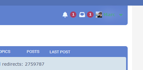
After the proposed change:

With some username colors it can be hard to read against the background color of the navbar:
We should use a darker text shadow to improve contrast instead of the wide white one currently used.
After the proposed change: