

-
Improvement
-
Resolution: Fixed
-
 Minor
Minor
-
3.3.11
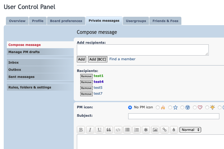
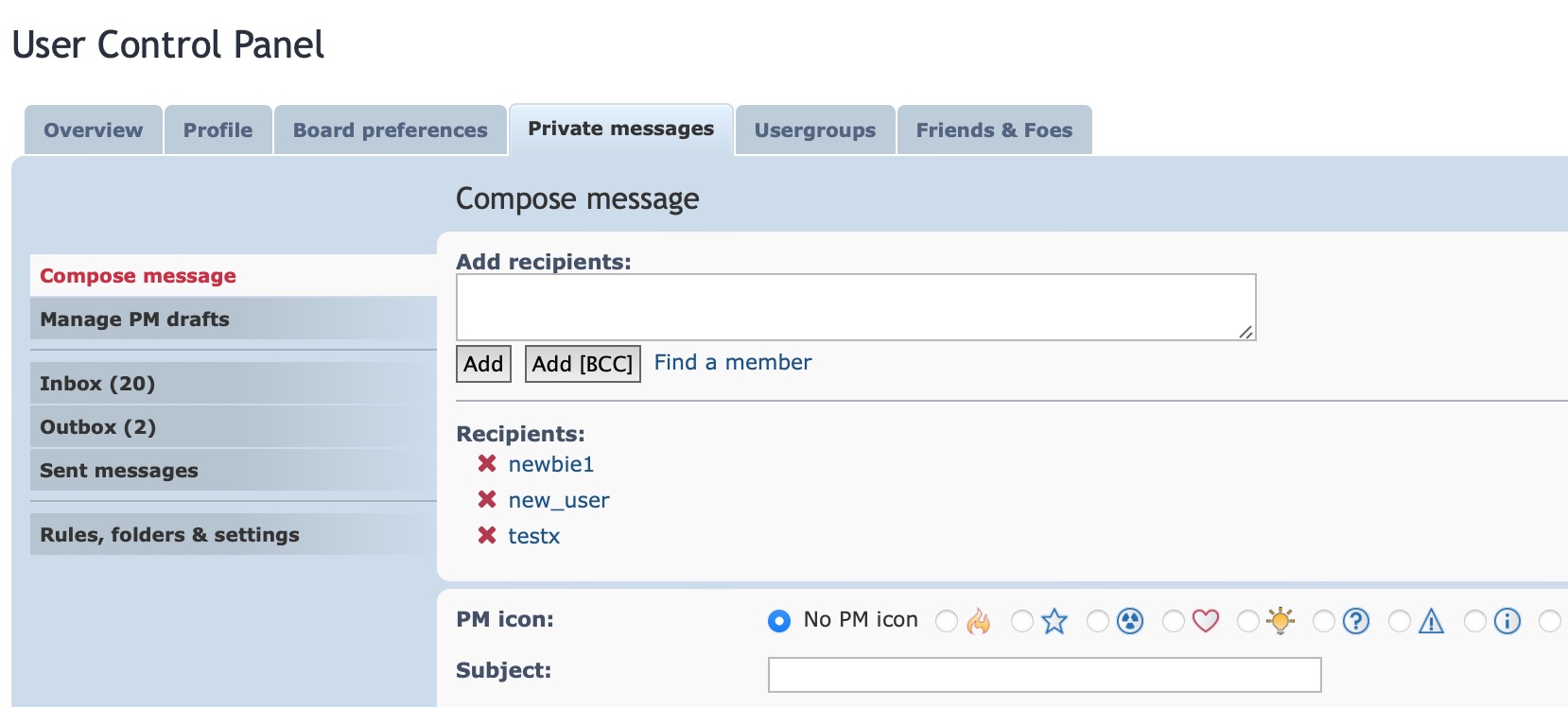
Whilst composing a message in the User Control Panel, you can add one or more users as a recipient and when you do so, a tiny little submit box (input) is displayed next to the person's username.
This button is used to remove people as a recipient of the message. The problem with this button is that it's SUPER small and the text for this button is a lowercase x.
My eyesight is okay, but isn't great and I really struggle to see it. Not only is the small x hard to see as it is, there's no left and right padding on the button which makes it look generally un-styled. As if it was forgotten about.
The dimensions for this button (in my browser) are 7px in width and 15px in height which is way too small for any UI element like this.
My proposal:
Add 2px padding to either side (left & right) of the button and replace the text to say Remove which is more meaningful in the current context. I also suggest that the button is moved to be on the righthand side of the username for readability improvements.
This change would overall be a win for the UI design and for accessibility.